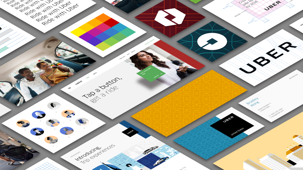
Uber’s 2016 rebrand was one of the most controversial in recent history. Wired’s Jessi Hempel says “the story is about more than a corporate rebranding effort. It’s a coming-of-age tale. It’s about Uber’s attempt to transform its purpose and cement a new reputation — to change not only how it is perceived throughout the world, but how it perceives itself.”
Here’s what made this rebrand so unique:
Uber wanted to recast itself as more than an on-demand taxi company. It had grand ambitions, some of which are now realities (UberEats) and others that never materialized (autonomous trucks)
Rather than hiring an experienced branding agency, Uber did it in-house with heavy involvement from Travis Kalanick
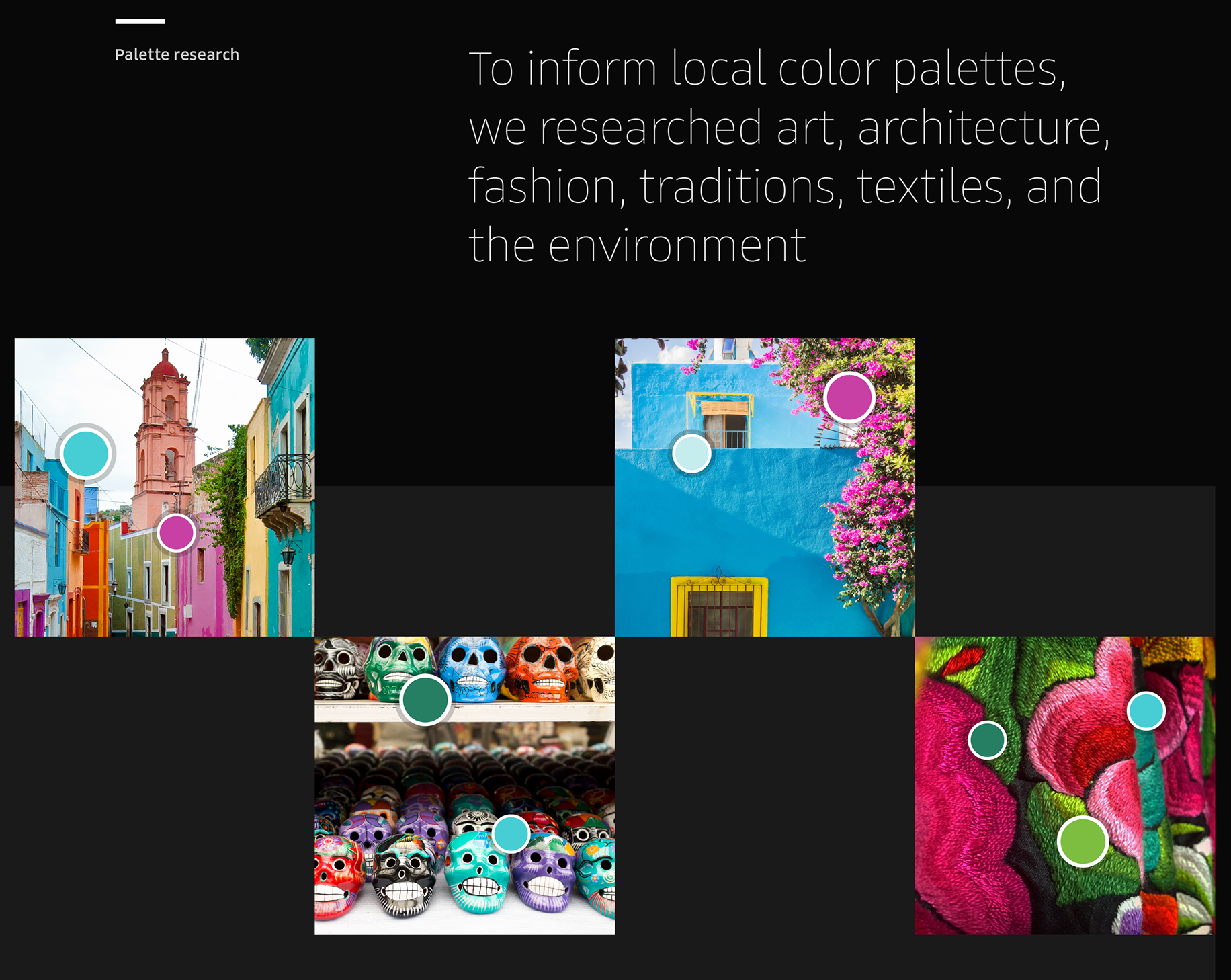
Rather than a single global look & feel (which is considered a best practice), the new strategy involved localizing certain colors and patterns to each region
Uber launched the rebrand in 2016, gradually backed-away from parts of it in 2017, and rebranded again in 2018 (Airbnb, for comparison, also had a controversial rebrand but has stuck with it)
I reviewed dozens of stories about the journey and reviews of the output to synthesize what we can learn from Uber’s journey. Below is what I learned.
#1: Branding Can Fill However Much Time You Give It
Let’s review the timeline:
Spring 2012: Uber has 50 employees and only 2 designers: knows there is a brand problem but Kalanick choses not to take it on
Late 2013: Kalanick and design director Shalin Amin kick-off a rebranding project. They take 18 months to align on brand values and interview a half-dozen agencies
Spring 2015: Kalanick' decides to do rebrand in-house with larger design organization Amin has built
June 2015: Week-long offsite to develop brand concepts
November 2015: Team arrives to something great, but has to kill it when they discovered it’s too similar to the brand of the State Bank of India
January 2016: The design team completes a new strategy which Kalanick approves
Feb 2016: New brand launches
At Codecademy our process took 8 months, 4 longer than planned. One benefit of using an external agency was that our agreed-upon budget was linked to the amount of time the agency had to work with us. This incentivized everyone including our CEO to achieve a satisfactory solution within the timeline or incur budget overages. In Uber’s case, it took the internal team including Amin and Kalanick nearly two years to complete the rebrand. I’m exhausted just thinking about it. I wonder if because it was an internal brand team they may have felt that “we’ll take as long as it takes to get it right.” One learning here is that branding can be the type of project that will expand to fill as much space as you give it.
#2: Good Leaders Remember to Let Some Fires Burn
I first heard the phrase “let fires burn” during Reid Hoffman’s Masters of Scale interview with Selina Tobaccowala of SurveyMonkey. It refers to the importance of sequencing (something Hoffman talks about often), and suggests great leaders know you have to chose which fires to put out and which to let burn. One thing we can learn from the story is that Kalanick and Amin saw the need for a rebrand in 2013 but chose to sequence other problems first. They picked the rebrand back up a year later when the team was bigger and better equipped to tackle it.
#3: How To Navigate A Highly Subjective Project That's Deeply Personal for the Founder
Image Source: Wired
The team spent 18 months getting aligned on five brand values or “pillars” that the visual design work would be built upon. “Uber aspires to be: grounded, populist, inspiring, highly evolved, and elevated.” During the design process, the team realized they were designing for Kalanick’s subjective tastes. ““We walked out and we were like, this is crazy—we’re designing a brand for Travis,” says Amin.” So shifting tacks, Amin tried to establish a set of design principles. By getting alignment from the brand team (which presumably included Kalanick) upfront, they would be able to refer Kalanick back to these principles as an objective rubric for evaluating solutions.
Getting aligned on a project’s acceptance criteria upfront is obviously a good best practice for any leader, but with something as subjective as branding it’s especially important. Typically designers have training on how to give feedback, and so they’ve learned how to make feedback specific and actionable. You can’t always expect a founder to have that training, and oftentimes I’ve seen founders give feedback like “I don’t like it” but not be able to get anything specific about why. Furthermore, in my experience branding is something that’s deeply personal to the founder (as evidenced by Kalanick’s choice to be personally involved), so establishing principles upfront can reduce second-guessing later.
#4: Brand Consistency: Don’t Throw Away An Iconic Look
One critical concept in brand strategy is that you want to build a distinctive look and feel in the marketplace and then reinforce this distinctive look and feel at every opportunity. So, understandably, most reviews that panned the new brand pointed out that Uber had succeeded in building a distinctive identity around the black and white U and with this rebrand they were pissed it all away.
However this reviewer defends the approach, saying the critics are applying 20th century branding best practices to a 21st century brand. She argues that a consistent look and feel is important to a CPG brand trying to get noticed on a physical shelf. But for Uber, it matters less. Uber is one of only a few transportation options and has already secured a place on your phone. It’s worth noting, however, that in Uber’s subsequent rebrand 2 years later they did return to the iconic black and white ‘U.'
#5: Good Branding Should Put the Customer at the Center
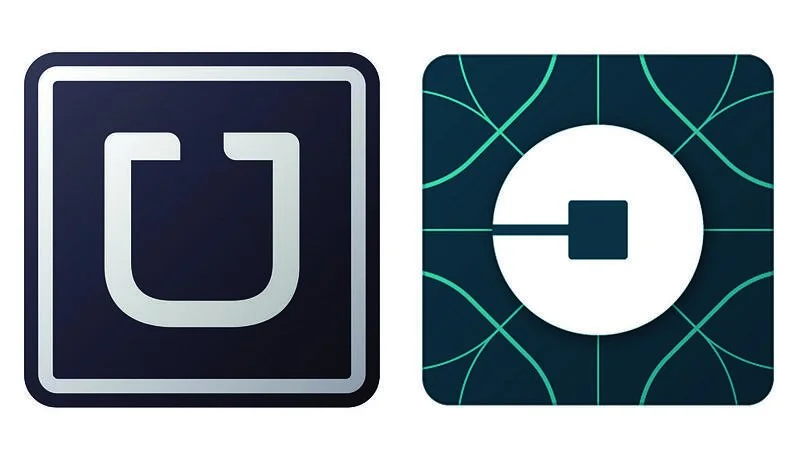
Here you can see Uber’s updated mobile app icon for riders. I liked the “bits and atoms” concept: Uber had been a leader in a new wave of startups digitizing our physical world, and that’s certainly an exciting narrative. This reviewer seizes onto Kalanick’s use of “bits and atoms” before the rebranding announcement in reference to their two major investors. He suggests the brand strategy was built around investors rather than riders and drivers. I wouldn’t go that far, but I would argue that “bits and atoms” puts Uber at the center of the story. The best brands put their customers, not themselves, at the center of the brand strategy. Nike, for example, doesn’t focus its narrative on the innovation behind their shoes. They celebrate the athletes wearing the shoes.
#6: Balancing Brand Consistency with Brand Localization Might Not Be Possible
Here’s a 2016 blog post by Kalanick announcing the rebrand, where he plays to the localization angle: “In Mexico, we were inspired by Mexican pink and the patterns in the local tiles; in Ireland, from the Georgian architecture and the lush greens.”
As Uber grew geographically and tried to compete with well funded local competitors like Via in New York, Didi in China, and Ola in India, it made sense to shed the unfriendly black-and-white for a more expressive style tailored to each geography. Localizing the logo could have provided a way to humanize the company and make it feel more locally relevant, but instead the bits and atoms foundation makes the brand feel even more artificial and abstract. Good theory, not so great execution.
#7: Brands Need Bravery: Unclear If An Internal Brand Team Or External Agency Is Better at Achieving It
In a piece in Campaign, leading brand designer Brian Collins critiqued the process. "As more companies build in-house creative teams the healthy objectivity provided by trusted outside creative partners can be lost. When a creative person's career and entire paycheck depends on keeping just one ambitious CEO happy, it's hard to respond with a hearty "NO" to the CEO's many requests. Fear pushes out bravery. Creativity quickly follows.”
This is a fair point, however the reverse could also be true: I’ve encountered many agencies that also lacked bravery. Consider that a branding agency might hope that a one-off branding project turns into an ongoing partnership, and therefore might not be comfortable pushing back on a CEO. A full time employee, on the other hand, might feel secure enough in her position to speak truth to power.
#8: Set Expectations This Brand Isn’t Forever
One of the benefits of studying a rebrand that launched in 2016 is we can examine how the brand has evolved since. Design blogger Eli Schiff makes a point of highlighting that over the next two years Uber made two updates to their logo: In 2017 Uber rolled-back the local colors and textures in favor of the iconic black and white. And by September 2018 Uber had rebranded again.
A friend who worked at Uber during this time suggested to me that the 2018 rebrand may have had less to do with design, and more to do with erasing any trace of Kalanick from Uber’s brand. Zooming out, in June 2017 Kalanick took a sabbatical from Uber, in July he resigned, and in August Dara Khosrowshahi was hired as CEO. Part of why Dara was hired may have been to rehabilitate Uber’s image, and numerous articles mention that brand metrics became a top priority after Dara joined. So the 2018 rebrand may have been about putting Kalanick’s time behind them.
Agency Wolff-Olins said they shifted Uber’s brand from “growth-focused to people-focused,” nailing one of my biggest critiques above. Uber updated the mission statement from “Make transportation as reliable as running water, everywhere, for everyone” to the much more amorphous “We ignite opportunity by setting the world in motion.”
On the rationale behind the new look and feel, Wolff-Olins had this to say: “Uber operates in 660+ cities globally. The brand needed to work around the world…Instead of pursuing a complex identity system, localized through color and pattern, we moved towards a universal ‘beyond-simple’ global brand.” The results (below) are decidedly more humanizing, something the brand sorely needed, and in many ways a roll-back to the distinctively utilitarian pre-2016 look.
I’ve found that when we’ve put a big process around a rebrand, and involved many stakeholders, folks inherently want to feel that if we’re putting in all this effort, we better stick with the output for a long time. This takes an already-tense project and raises the stakes even higher. Now that we’ve sen that even Uber is making brand changes every year, I wonder if it might have been helpful as we embarked upon EasyKnock’s rebranding process to be able to point to Uber and others and be upfront that we’ll certainly make changes again a year from now. I wonder if that might have helped release some of the pressure.
Conclusion
So, alas, here are some final thoughts on what we can learn from Uber’s rebranding efforts:
Let Fires Burn - wait as long as possible before taking-on a major project like a rebrand - only do it if absolutely necessary and when you have the team to do it well
Have Clear Timeline and Stick to It - a branding project can drag on for months and years. Set a timeline and commit to shipping a solution on-time. Acknowledge it might not be perfect, but that we can iterate on it once in-market
Building a distinctive look is still important - Uber shrugged-off the distinctive black and white ‘U’ in 2016, but in subsequent iterations chose to revive it
Put your customers, not yourselves, at the center of the brand narrative
Acknowledge upfront that this brand system will evolve and eventually be replaced - it may help lower the stakes and improve your probability of success
You Won’t Please Everyone - in this modern social media era every rebrand faces criticism. Expect it and don’t let it phase you.


